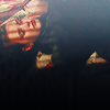
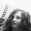
Nice set! I like how you worked with rotation a lot. I like the last two icons especially! But 05 has a second-glance appeal, too - it's hard to see what's on it at first but resolves neatly when you look more closely. Really great!
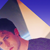
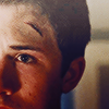
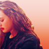
Thank you so much for this very insightful and thoughtful feedback, which is exactly what a beginner like me seeks. I wanted to experiment with crop that's why I chose this challenge and kept the composition of the icons pretty simple , as you may have noticed. :) Glad you liked it.
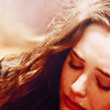
Inspiration of the 5th Icon came for Hannah's own description of what she was feeling at that exact scene ( the night before her suicide ) a great black nothing . That's why I tried to make it look like Hannah lying in a pool of blackness.
![[personal profile]](https://www.dreamwidth.org/img/silk/identity/user.png) magicrubbish) wrote in
magicrubbish) wrote in ![[community profile]](https://www.dreamwidth.org/img/silk/identity/community.png) fandom10in302018-06-21 04:04 pm
fandom10in302018-06-21 04:04 pm
no subject
no subject
no subject
6 is amazing and I am deeply in love with 10
no subject
no subject
no subject
no subject
no subject
Inspiration of the 5th Icon came for Hannah's own description of what she was feeling at that exact scene ( the night before her suicide ) a great black nothing . That's why I tried to make it look like Hannah lying in a pool of blackness.
no subject
Wow, that's amazing. I love icons with layered meaning like that!
no subject
no subject
no subject
no subject
no subject
no subject